Color Blocking Outfit Ideas
Imagine turning heads with every step you take. The secret lies in a bold and creative styling technique. It transforms simple pieces into stunning statements.
As artist Wassily Kandinsky once said, “Color is a power which directly influences the soul.” This power is at the heart of the trend we’re exploring today.
This approach combines vibrant, contrasting shades in solid sections. It creates visually striking ensembles that feel fresh and modern.
With the resurgence of Y2K aesthetics, bright hues are more popular than ever. This method allows you to refresh your look with minimal effort.
You can create dynamic looks using items already in your closet. It’s all about pairing them in unexpected and exciting ways.
This guide will walk you through mastering this confident style. You’ll learn to select palettes, balance proportions, and express your unique personality.
Get ready to embrace a world of bold combinations. Transform how you get dressed each day.
Key Takeaways
- This technique uses solid blocks of contrasting hues to create eye-catching looks.
- It’s a versatile trend rooted in modern art and design principles.
- You can achieve this style with pieces you likely already own.
- It offers a simple way to refresh your wardrobe and make a bold statement.
- Balancing proportions and choosing complementary shades are key skills.
- This approach works for casual, professional, and special occasion wear.
- Embracing this method can boost your confidence and personal expression.
Introduction to Color Blocking Outfit Ideas
Discover the styling secret that fashion insiders use to create unforgettable ensembles. This method is more than just wearing bright shades. It’s a deliberate art form for your wardrobe.
What Is Color Blocking?
Color blocking is a technique where you wear solid, contrasting hues in distinct sections. You combine two or more bold shades without blending them. The goal is to create clear visual separation.
This approach has deep roots in modern art. It draws inspiration from pioneers like Piet Mondrian. The style hit mainstream fashion in the 1960s with iconic designers.
It differs greatly from traditional coordinated dressing. Instead of matching tones perfectly, it celebrates bold, unexpected pairings. Your final look becomes dynamic and eye-catching.
| Traditional Coordinated Dressing | Color Blocking Style |
|---|---|
| Seeks harmonious, blended color schemes | Embraces high-contrast, solid sections |
| Often uses monochrome or neutral palettes | Uses vibrant, distinct blocks of color |
| Focuses on subtlety and perfect matching | Focuses on bold statements and visual impact |
| Can feel safe or conventional | Feels fresh, modern, and artistic |
Why It’s Trending Now
This trend offers incredible versatility. You can create subtle, sophisticated outfits with muted tones. Or, go for maximum impact with vibrant combinations.
It’s a refreshing antidote to years of minimalist fashion. People now crave self-expression and optimism in their clothes. The technique is also wonderfully inclusive for all ages and body types.
Vivid hues can uplift and revive one’s appearance, which is especially flattering. Social media loves how these ensembles photograph. With the Y2K revival, bold, playful aesthetics are defining 2025 fashion.
Understanding the Fundamentals of Color Theory

Every great artist needs a palette, and for fashion, that palette is defined by a classic circle. This fundamental knowledge lets you make intentional, harmonious choices. It transforms random pairings into polished, striking ensembles.
Working with the Color Wheel
This circular diagram is your essential styling tool. It organizes hues in a specific order, showing how they relate. You can easily identify which color combinations will create the effects you want.
Think of the color wheel in terms of two main families. Cool shades like purple, blue, and green are on one side. Warm tones like yellow, orange, and red (including pink) are on the other. Staying within one family helps create cohesive blocks.
Complementary and Analogous Colors
Complementary shades sit directly opposite each other on the wheel. Think blue and orange or red and green. These pairings create maximum contrast and vibrant visual impact.
Analogous neighbors are adjacent on the circle, like blue, blue-green, and green. They offer a more harmonious and subtle feel. Understanding these relationships gives you confidence to build bold, beautiful looks.
Mastering Color Blocking Outfit Ideas
Forget strict rules—mastering this trend is about understanding core principles and then making them your own. It’s a creative process tailored to your personal style, body type, and comfort level.
The key lies in balancing experimentation with intention. You want to push boundaries, but each look should feel purposeful, not chaotic.
Start by asking yourself what you hope to achieve. Are you seeking bold statements or a subtle wardrobe refresh? Also, consider where you’ll wear these color block outfits. A creative workplace allows for different combinations than a formal setting.
Successful execution requires attention to several elements at once. This includes your choice of colors, garment proportions, fit, and even accessories.
This guide will build your knowledge step-by-step. Remember, practice builds confidence. Your first attempts might feel daring, but you’ll soon develop an intuitive way of creating ensembles that feel authentically you.
Finding Your Personal Color Palette

Before you mix vibrant shades, discover which ones make your skin glow with health. Your personal palette is the foundation for every bold combination you create.
Wearing hues that complement your natural undertones enhances your appearance. Unflattering shades can make you look tired.
Identifying Your Skin Undertone
Your skin’s undertone is the subtle hue beneath its surface. It stays constant, unlike your tan or redness.
Knowing it helps you choose the most flattering colors. Use these simple, at-home tests to find yours.
| Test | Cool Undertone Sign | Warm Undertone Sign | Neutral Undertone Sign |
|---|---|---|---|
| Vein Color on Wrist | Blue or purple | Green | Blue-green or unclear |
| Preferred Jewelry Metal | Silver | Gold | Both look good |
| Better in White or Cream? | Pure white | Off-white cream | Both are flattering |
Matching Colors to Personal Style and Occasion
Once you know your undertone, explore your best color families. Warm tones shine in earthy shades like mustard and terracotta.
Cool tones are enhanced by jewel shades like sapphire and emerald. Neutral tones can experiment with a wide range of colors.
Also, think about where you’ll wear your bold outfit. Vivid combinations are perfect for casual fun.
Muted or tonal looks feel right for formal settings. Your personal style and the event guide your final choice.
How to Style Color Blocking Outfits for Beginners
The journey to mastering vibrant ensembles begins with two accessible techniques. If you’re new to this trend, the easy way is to start simple. This builds confidence without overwhelming your senses.
Focus on foundational methods that feel approachable. You’ll learn to use color blocking principles with items you likely own. Let’s explore these beginner-friendly strategies.
Starting with a Neutral Base
When learning how to color block, anchor your look with neutrals. Shades like black, white, gray, or beige create a calm foundation.
They act as visual “rest stops” between bolder hues. This prevents your outfit from feeling too busy. Try black pants with a gray top, then add a bright blue jacket.
This strategic use color blocking lets you experiment safely. Your eye gets a place to pause. It’s a perfect first step in your styling journey.
Experimenting with Monochromatic Looks
Another great method is to focus on one color. A monochromatic approach uses different shades and tones from a single family.
Pair a pale lavender top with deeper violet pants. Add a medium purple cardigan for depth. You create sophisticated visual interest without clashing.
Working with one color teaches you about proportion and balance. It’s a lower-risk way to achieve that intentional, blocked look. You master the technique within a harmonious palette.
| Feature | Neutral Base Method | Monochromatic Method |
|---|---|---|
| Best For | Adding bold accents safely | Creating depth with harmony |
| Color Focus | 2-3 distinct colors | Multiple shades of one color |
| Beginner Ease | High – neutrals simplify | High – no clashing risk |
| Visual Effect | Anchored and balanced | Sophisticated and cohesive |
| Key Tip | Let accessories be your color block | Play with light and dark tones |
Exploring Color Combinations and Proportions

The magic of a striking ensemble often lies in the daring dance between hues and their placement. Getting both elements right transforms a simple idea into a powerful style statement.
Understanding proportions is just as crucial as picking your palette. The size and placement of each solid section dramatically affects your overall look.
Creative Pairings for Bold Statements
A flattering approach is the 60-30-10 rule. Use a dominant color for 60% of your look, a secondary one for 30%, and an accent for 10%.
This creates a balanced hierarchy. For bold energy, try unexpected combinations that break traditional rules.
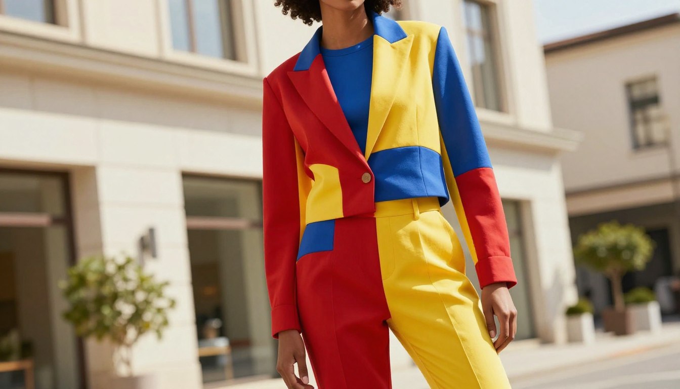
Orange paired with green creates a modern, energetic vibe. Add a third accent like purple flats for a winning look.
Saltwater blue and gold offer a sophisticated twist. It mixes cool, complex tones with warm, vibrant yellow.
Neon yellow and purple create an electric, high-energy statement. The extreme contrast ensures you’ll stand out.
For a tropical feel, pair emerald green with bright coral. It brings together nature-inspired tones with vibrant warmth.
More subtle blocks work beautifully too. Try mint green with orchid lavender for a soft, fresh aesthetic.
Navy blue and mustard yellow create a polished, elegant pairing. It works exceptionally well for professional settings.
Don’t shy away from red and green outside the holidays. Choose the right shades and proportions to feel fresh and modern.
Inspiring Outfit Examples to Spark Your Creativity
Let’s move from theory to practice with concrete examples that spark immediate creativity. Seeing how others style bold hues offers the best inspiration for your own wardrobe.
Look Inspirations from Real-Life Examples
Notice how a muted blue skirt set with red flats creates a sophisticated, toned-down complementary pairing. For a casual yet polished look, try a blue jacket with pink shorts and a neutral tee.
Layering offers advanced style. A purple sweater under a pinkish dress creates dimension. Similarly, a pink sweater under a green cardigan, paired with denim, feels effortlessly cool.
Seasonal Adaptations and Trends
Your bold ensembles should evolve with the calendar. Lighter, brighter combinations shine in warmer months, while deeper, richer tones define cooler seasons.
| Season | Recommended Palette | Overall Vibe |
|---|---|---|
| Spring & Summer | Pastels, Neons, Crisp Brights | Fresh, Energetic, Playful |
| Fall & Winter | Jewel Tones, Earthy Shades, Deep Neutrals | Rich, Cozy, Sophisticated |
This simple shift keeps your outfits feeling current and appropriate all year long.
Techniques for Flattering Color Blocking

Beyond making a statement, this technique can sculpt and flatter your figure. It’s a powerful tool for creating silhouettes that highlight your favorite features.
You can use color placement to change how an ensemble affects your shape. Strategic choices create visual balance and harmony.
Using Color Placement Strategically
Think about where you place each vibrant shade. Brighter, lighter hues near your face draw the eye upward.
This enhances your complexion and creates a flattering focal point. It’s a smart way to highlight your best features.
Conversely, darker, richer tones on your bottom half have a slimming effect. They ground the look and visually lengthen your legs.
This principle of visual weight is key. Darker shades recede, while lighter ones advance.
For a seamless, elongating effect, stick to one hue from the waist down. This avoids “chopping” your silhouette.
Match your shoes to your pants or your skin tone. It creates an unbroken line that further streamlines your proportions.
Balance is essential. If your top is a bold color block, pair it with neutral bottoms.
This creates a composition that feels intentional. You control how this style works for your unique shape.
Experiment to find the most confident color placements. You can use color not just for trend, but for a truly flattering finish.
Mixing Patterns, Textures, and Colors
Texture is the secret ingredient that transforms simple color combinations into rich, tactile experiences. Advanced color blocking goes beyond solid pieces. It weaves different fabrics and patterns for sophisticated depth.
This way of styling adds visual interest that elevates your entire look. It works brilliantly within a monochromatic scheme.
Layering Different Fabrics
Start by pairing contrasting materials. A silky blouse with structured woven pants creates instant dimension. Combine a soft cotton tee with a leather jacket for luxurious contrast.
Pleated fabrics add movement, making solid colors appear dynamic. This textural mix adds complexity without clashing.
Incorporate patterns carefully. Choose prints featuring the hues you are already using. A striped top can act as built-in color blocking, tying different pieces together.
Don’t shy away from mixing casual and dressy textures. A denim jacket over a silk skirt feels contemporary. This high-low mix reflects how people dress in real life, making bold colors feel grounded and intentional.
Spotlight on Top Apparel Brands for Color Blocking

The quality of your vibrant ensembles often depends on the apparel brands you choose. Certain labels excel in offering the rich hues and consistent fits needed for striking combinations.
Investing in quality pieces from these companies gives you a flexible foundation. You can mix and match to create multiple block outfits.
Comfort Colors and Bella+Canvas Highlights
Comfort Colors shirts are a top option. Their garment-dyed process creates a unique, soft feel. The colors remain vibrant wash after wash.
This makes them perfect for casual, eye-catching color block combinations. Bella+Canvas is another fantastic option.
They offer modern fits and a vast array of shades. Their tees are versatile for dressed-up or casual look.
| Brand | Key Feature | Best For | Color Range |
|---|---|---|---|
| Comfort Colors | Garment-dyed, worn-in feel | Casual, relaxed combinations | Vibrant & rich hues |
| Bella+Canvas | Modern, flattering fit | Polished or everyday style | Vast array of shades |
| Jerzees | Dedicated Color-block line | Built-in contrasting panels | Strategic color panels |
| ComfortWash by Hanes | Vintage-inspired vibrancy | Relaxed, approachable outfits | Wide range of hues |
| Boden | Pre-designed details | Curated, effortless blocking | Coordinated palettes |
Other Notable Brands in the Trend
Jerzees offers an innovative approach with its dedicated color block line. These pieces have contrasting shades built right in.
ComfortWash by Hanes delivers vibrant colors with a soft, vintage appearance. It’s great for a relaxed vibe.
For a curated color approach, consider Boden. Their designers frequently create garments with built-in blocking details.
This lets you embrace the trend without crafting the combinations yourself. Each brand provides a unique path to bold style.
Practical Do’s and Don’ts of Color Blocking
To master the art of bold combinations, it’s essential to know both the pitfalls to sidestep and the expert strategies to embrace. These simple guidelines will help you create color-blocking outfits that feel intentional and stylish.
Common Mistakes to Avoid
Avoid using more than three bold colors in one ensemble. Too many hues can look chaotic instead of chic.
While contrast is key, ensure your chosen pairings feel intentional, not jarring. Always assess how shades work together.
Don’t neglect proportions. Balance large blocks of color with smaller ones to create a flattering silhouette.
Never forget your accessories. Bags, shoes, and jewelry are crucial for tying your whole color block outfit together.
Expert Style Tips
Learn basic color theory. This knowledge is a foundation for pairing colors like a pro.
Start simple. Use color blocking with one bold garment and introduce a second vibrant hue through your accessories.
Always include a neutral. Black, white, or tan anchors bright colors and makes the look more wearable.
Layer separates. Adding a bold jacket creates dimension and offers control over your color blocking placement.
Remember, accessories count as a color block. A bright bag or shoes can be one of your three main hues.
Conclusion
You now possess the tools to transform your wardrobe with confidence and creativity. Color blocking is a powerful style technique that lets you express your personality. This comprehensive guide has provided the fundamentals to help you master it.
Remember the practical tips on color theory and proportions. Use them as a foundation for your experiments. The most striking results often come from unexpected pairings.
Start with the easy way if you’re new, perhaps with a neutral base or a simple tee. Build your confidence gradually. Take a look at the inspiring examples for fresh inspiration whenever you need it.
With this knowledge, you’re well-equipped to create stunning block outfits for any occasion. Embrace the joy of putting together bold combinations. Your fashion journey just got more exciting and personal.
FAQ
What exactly is color blocking in fashion?
How do I start if I’m new to this trend?
What are some foolproof color combinations to try?
How can I use color blocking to flatter my figure?
Can I mix patterns with color blocked pieces?
How do I know which shades suit my skin tone?
Are there brands known for great color-blocking pieces?
What’s a common mistake to avoid?

Eduard Kingly is a travel and lifestyle content creator with a focus on personal development and education. He combines firsthand travel experiences with research-driven insights to guide readers in discovering new places, building better habits, and pursuing meaningful learning.